Problem
How might we turn low-engagement, brochure-style financial content into a format teenagers can navigate quickly, understand clearly, and actually finish on mobile?
 Juan Ramírez
Case Study · Banco Itaú
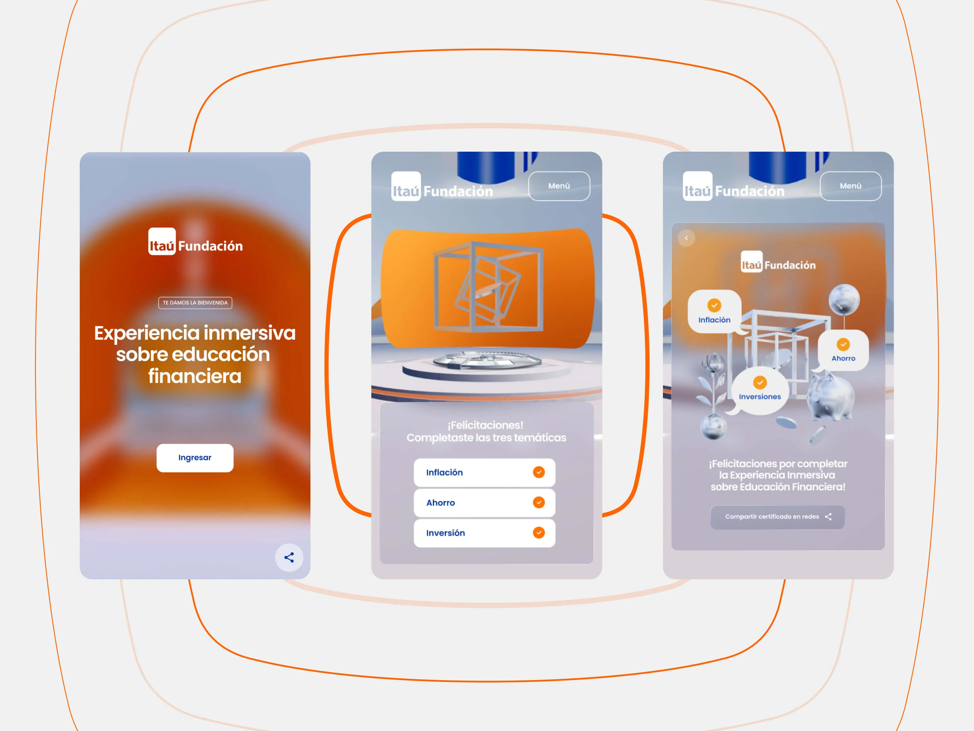
Itaú Fundación needed to move from static brochure-like educational material to a digital product teenagers would actually complete. We designed and shipped a mobile-first immersive web experience in 7 weeks, combining UX/UI structure, symbolic 3D environments and instant feedback loops to make concepts like inflation, savings and investment easier to understand.
How might we turn low-engagement, brochure-style financial content into a format teenagers can navigate quickly, understand clearly, and actually finish on mobile?
We delivered a 3-module mobile-first learning experience with spatial navigation, quiz feedback loops and shareable completion, increasing attention time and completion quality.
Concept, Design and Prototype in 7 Weeks
We worked as a compact team and focused on shipping a clear, testable product fast. The goal was to combine UX structure and 3D interaction without adding friction for teenage users.
Mapped financial education and gamified products to define interaction expectations.
Defined a mobile-first teenage audience with low tolerance for friction.
Built a 3-module structure: Inflation, Savings, Investment, each with a consistent UX loop.
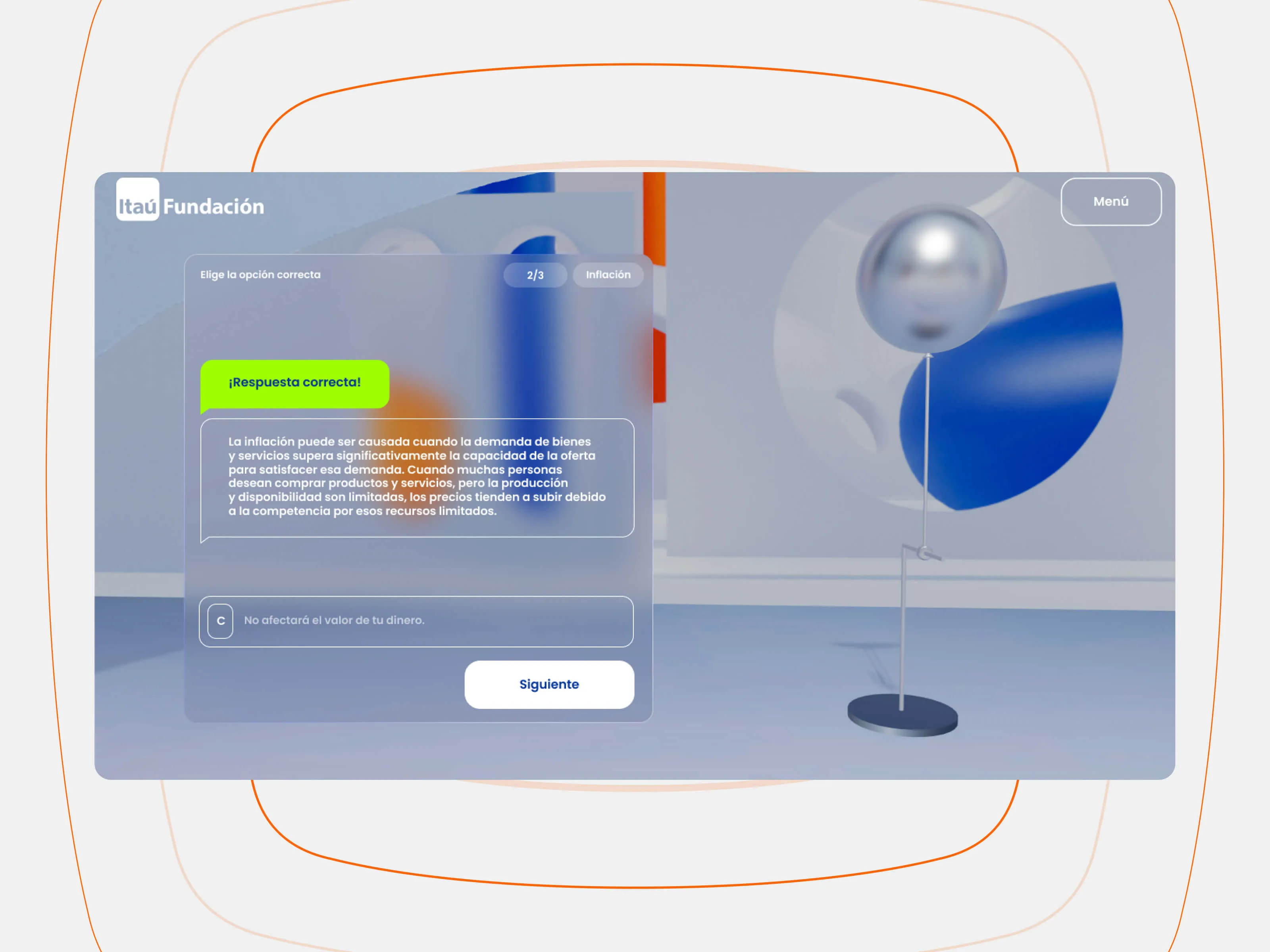
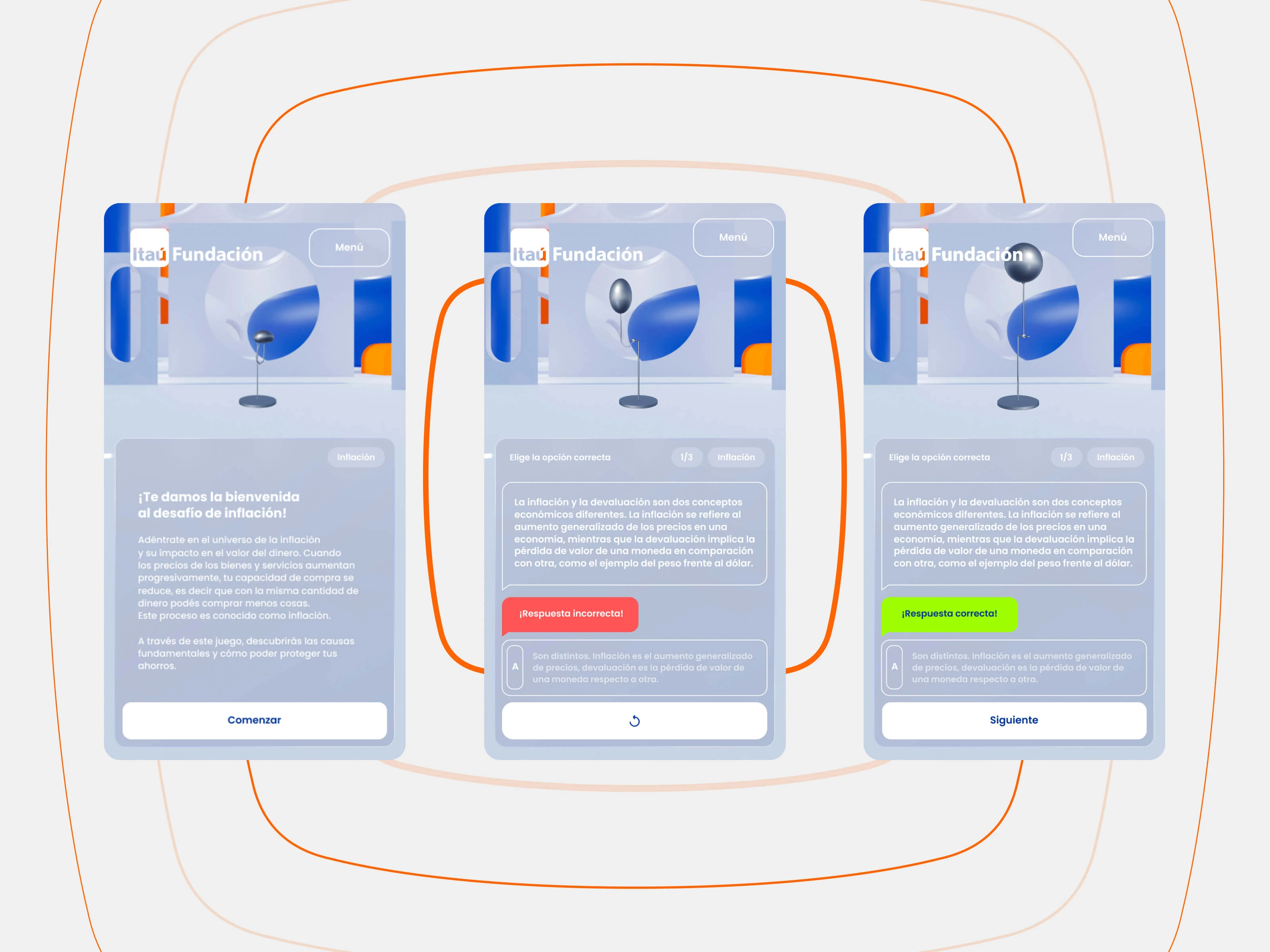
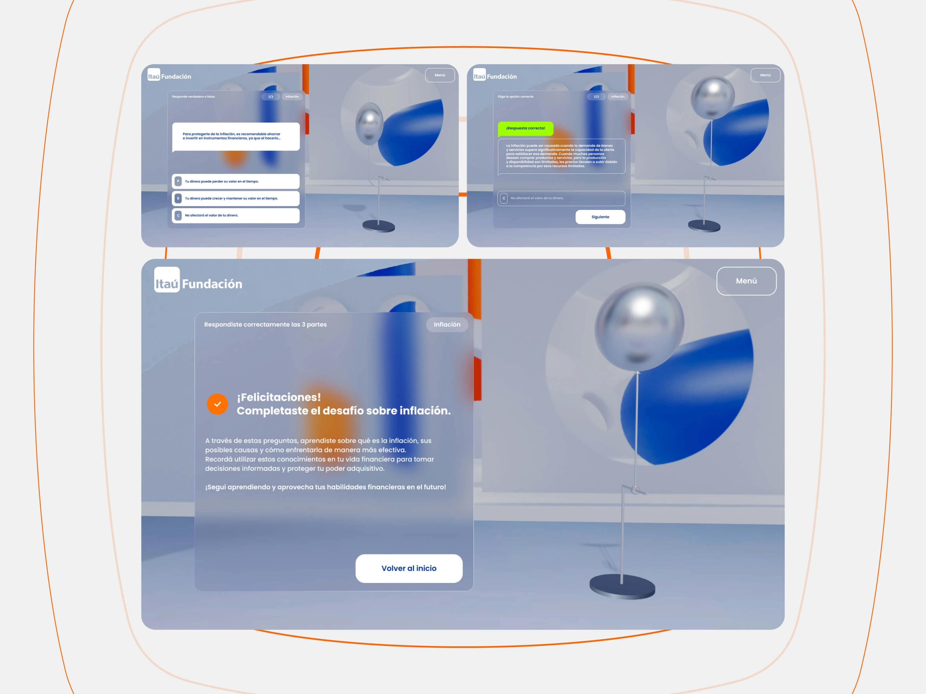
Covered all states: intro, trivia, right/wrong feedback, module completion, certificate.
Balanced immersive visuals with readable hierarchy and fast mobile interaction.
3 modules:
Savings, Inflation, Investment
Consistent flow:
Introduction → Trivia → Feedback
Business goal:
Educate with clarity.
User need:
Learn without friction.
Feature #2
Each module followed a short and repeatable pattern: concept intro, question, immediate answer feedback, and next step. This made learning active and measurable.
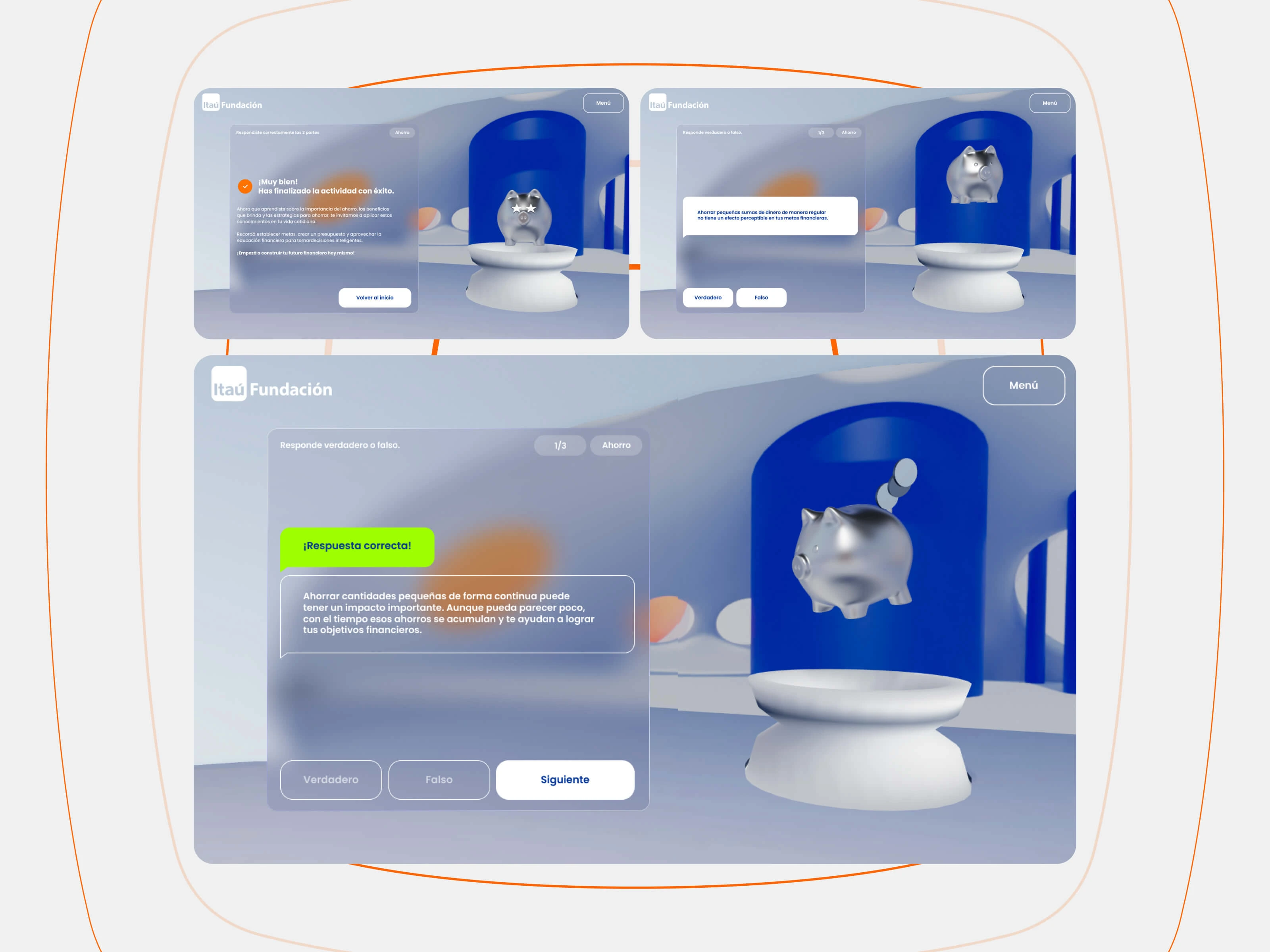
The client highlighted usability and visual clarity as key strengths. The immersive format kept attention longer and increased module completion compared to brochure-style content.
↑
Higher time on experience
✓
Strong completion rates
★
Positive stakeholder reception
If we had more time, I would add guided onboarding for 360° navigation and lightweight progress-saving between modules. The core principle remains the same: intentional 3D + clear UX beats visual overload.